How to Use IconPark in Vue 3
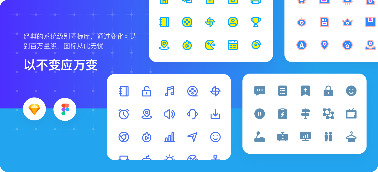
In web development, font icons like FontAwesome or IconPark are often used to make websites more vivid. IconPark is an icon library provided by ByteDance, offering over 2,000 high-quality icons that cover most scenarios. This article shares how to use IconPark in Vue 3.
Installing IconPark
Copy the following command to install IconPark:
npm install @icon-park/vue-next --save
Using IconPark
If you do not mind the bundle size, you can globally register IconPark. Configure the following code in your main.js:
import {install} from '@icon-park/vue-next/es/all';
import {createApp} from 'vue';

const app = createApp({});

// Install
install(app); // use default prefix 'icon', eg: icon is People, name is icon-people.
install(app, 'i'); // use custom prefix 'i', eg: icon is People, name is i-people.

app.mount('#app');
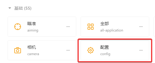
Visit the IconPark official website: https://iconpark.oceanengine.com/official
Find the icon you want to use, for example: config
Then, in your component (in the template), you would use:
<icon-config></icon-config>
Personally, I do not recommend global registration because many icons are unnecessary, which leads to a very large bundle size. The official documentation provides a method for on-demand importing using the babel-plugin-import plugin, but I was unable to get it to work. I am unsure how to configure this plugin. Perhaps Vue 3 with Vite bundling cannot use the babel-plugin-import plugin? If anyone knows, please help me, xiaoz.
So, xiaoz had to use a simpler method: import only the icons you need. First, import the default IconPark styles in main.js:
import '@icon-park/vue-next/styles/index.css';
Then, import the specific icons you need in your component, for example:
import {
    ListNumbers as iconListNumbers,
    Warehousing as iconWarehousing,
    CodeComputer as iconCodeComputer,
    EthernetOn as iconEthernetOn,
    LinkThree as iconLinkThree,
    FolderOpen as iconFolderOpen
} from '@icon-park/vue-next';
I added a unified alias prefix icon to avoid naming conflicts with my own components (it is recommended to add an alias prefix). In the template, you simply call:
<icon-folder-open></icon-folder-open>
Of course, you can also add attributes like color and size, for example:
<icon-folder-open theme="outline" size="24" fill="#f5a623" strokeLinejoin="bevel"></icon-folder-open>
Important Notes
- In the official online icons, the names are all lowercase, such as
config. When manually importing, use PascalCase. The first letter should be capitalized in the import statement, e.g.,import Config from '@icon-park/vue-next'. - If the name is like
dislike-two, the import statement should beDislikeTwo. - When using in the template, change everything to lowercase and separate words with hyphens.
IconPark Official Website: https://iconpark.oceanengine.com/ This article references parts of: https://github.com/bytedance/IconPark/blob/master/packages/vue-next/README.md